Thursday, 21 March 2013

Flouro Fever

My dreams are being haunted by Simone Rocha.  More specifically, the flouro broderie anglaise from her Spring Sumer 2013 collection.


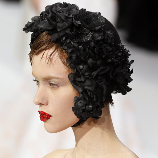
I interviewed her at the beginning of the year - or perhaps it was the end of last year - for the February issue of Vogue Russia, and she talked me through the influences behind the collection, which is basically all about being a really cool teenager, and in love, and hanging out in some lane in Dublin kissing boys, while also being quite sophisticated, At least, that is what I took away from it. Oh, and she's also really really nice. 

And it made me remember one of Katie Grand's old editor's letters, back when she was at the helm of POP, which opened with the line "I was a great teenager."  And then it went on to say something like "you can work hard, and one day you might be too rich, and you might be too thin, but whatever you do, you can never be too young again."

Well, I wasn't a great teenager, at all.  And I think that one of the reasons that I love Simone Rocha's collection so much is that I feel that it gives me a second shot at it - even though I've got a mortgage and two children.  And this time, I would be really well dressed (in Simone Rocha) and not carrying puppy fat!  (Well, I'm not slim yet, but Malcolm Coombes the amazing dancing/ boxing trainer is getting me there, and I have faith that I will be whip thin by the time the sun comes out.  Especially if I continue to spend my evenings sewing like the incredibly uncool thirty year old that I am, rather than eating chocolate.  Of course, if I was out dancing, like I was when I was younger, well, I wouldn't need Malcolm.)

But in the mean time, not wearing Simone Rocha, and with a body that is not yet entirely lithe and pre-children-esque, I'm being made incredibly happy by two flouro-esque cuffs that I picked up from the post office this morning, designed by my friend Bettina von Sachsen Weimar.

I've got an orange one and a purple one, and I'm wearing them both together on the wrist that doesn't host the flouro pink Toy Watch, and they look amazing.  The little gold charm things are all detachable, and I've just got stars and crowns on mine because I'm not really a shooting kind of person though Bettina is which is why there are cartridges and wild boar too.  (She's German.  They have wild boar there.  She's also a princess, hence the crowns.  And I love a crown.  It's one of the reasons that I dress my children in Marie Chantal.)

And they also make me feel sort of teenagery again, because there's a hint of the friendship bracelet about them, insofar as Bettina is my friend, and I love them so much that I want to give them to all my other friends, and make them as happy as I am.  

And I'm getting so carried away by all of this that I'm seriously considering having a couple of flouro pink highlights put in my hair for the summer (once I'm thin.)  But perhaps that is going too far.  My husband would be horrified.  Because, as mentioned earlier, I'm not actually a teenager.  So I think, if I am going to do flouro this summer, I need to remember that Simone Rocha's collection was sophisticated as well as young.  And then look at Spring 2013 Atelier Versace, which had some properly grown-up flouro:


Bettina's bracelets are sophisticated though - knowing her, they'd have to be - Bettina used to wear Hermes scarves for tea when we were nineteen, and her cuffs share her wrist with a Cartier Tank Francaise, rather than a Toy Watch.  So here are some more of her designs - these ones are wrap bracelets - just to tempt you:  


Bettina's bracelets can be found at www.bvs-design.com

Tuesday, 19 March 2013

Anna Harvey on Flowers

Lent is nearly over, the days are finally becoming warmer, and The Flowered Corner on Ladbroke Grove - my local, and preferred, flower shop - is full of anemones, ranunculus, hyacinths and tulips, all crying out to be bought, taken home, and arranged in vases around the house, where they will distract people from the buildup of dust.  (I'm training up Sholto to be our cleaner.  He's actually quite into it, and even has his own very special sheepskin duster which he bought in Masham Market on our last North Yorkshire trip; sadly, the fact that he's only about two foot tall means that he can't reach everything yet.  He'll grow.)


To return to the point: everything I know about cut flowers, I learnt from Anna Harvey, the eternally chic ex-British Vogue Fashion Director, now Editorial Director of the majority of the international Vogue titles (she is the woman behind the launch of Vogue in Russia, India, Turkey, the Netherlands, and most recently Ukraine - to name but a few . . . )  As her assistant, one of my jobs was to go and choose the week's flowers for her office from the barrow on Bond Street.

And, as often becomes the case, I caught her aesthetics.  It is entirely due to Anna that I prefer to see a single type of bloom in each vase, and usually of a single hue (though I do love a mixed bunch of ranunculus).  It was she who made me see that flowers are an essential part of entertaining, even if the entertainment in question is a work-related meeting.  She taught me how to care for flowers,  and how to make them live as long as possible.  "I love flowers, I really do," she explains.  She once described herself in an interview as a 'cabbage rose sort of person', and "I think I am in every way.  I love pretty things.  I admire minimalism, but decorative is more my bag." So here are her tips:

- Only buy what is in season.  Peonies may look tempting in March, but they're not ready, and won't open properly.
- Find a good florist, and form a relationship with them - they know a lot about their stock, and they will let you know what is best. (Anna is a regular both at the afore mentioned barrow on Bond Street, and Only Roses on the Brompton Road.)
- Trim an inch off the bottom of the stems as soon as you get your flowers home.
- Water needs checking and changing regularly; it really does prolong life.
- Another couple of days can often be achieved by cutting down the stems when the heads start looking a bit droopy.
- When the heads of roses start to bow, they can sometimes be revived by being laid flat in a luke warm bath, so that the water doesn't have to work against gravity to reach the flower itself.
- When it comes to arranging the flowers, some, like roses, work better in an opaque vase (their stems turn the water green, not a pretty look); others, such as peonies or anemones, look heavenly in a glass bowl.
- If you're buying for a specific occasion, such as a dinner party, buy two or three days in advance.  Tulips, roses, ranunculus, peonies, anemones and many others besides look much better when they've started to open.
- If in doubt, buy more flowers than you think you will need.  Nothing is more miserable than a half empty vase.
- Finally, if you can't decide what to buy, go for roses.  And even if you are going to put them in a tiny jug at home, buy the long-stemmed variety; the longer the stem, the fuller the head.  (Although, having said that, spray roses arranged in jam jars look adorable.)

Of course, Anna is not the only person working in fashion to have developed a long lasting love affair with flowers:  roses, poppies, daisies and more are ever finding their way onto the catwalk and into shoots (and some houses will forever be associated with a certain flower;  I can not see a camellia without thinking of tweed, gilt chains and quilting.)  Anna, who has more style than anyone else I know, cites the rose headdresses from the Spring Summer 2013 Dior Couture collection as being a current source of inspiration; as for shoots, I happen to know that a certain Paolo Roversi shoot for Vogue India would probably rank among one of her all time favourites, if pressed.  


Dior Couture, Spring Summer 2013


Paolo Roversi for Vogue India launch issue, October 2007

Sadly, I'm unlikely ever to be a couture customer.  But there are always cabbage roses, Anna's favourite:


The Flowered Corner:  110A Ladbroke Grove, 020 7221 3320
Only Roses:  257 Old Brompton Road, 020 7373 9595

Sunday, 17 March 2013

Can one ever have too many cushions?

So, having spent over six months looking for the perfect lampshade, two come along at once.  This one is from the Danish homeware store, Rice, and the ostrich is hand embroidered.  I think it will look beautiful on the lamp in my bedroom, and actually will go quite well with the Timorous Beasties Bell Moth shade on the overhead light. (If I buy it, that is.)
Let's face it, I will never manage to live in a Modernist home.  Or, indeed, according to Edith Wharton's rules of decoration:  she disapproved of wallpaper, thinking it unhygienic - which simply won't work for me because when I drift off into happy reveries, fantasy decorating houses that I don't own (but might, one day) there's wallpaper in every single room.  My love of it is so great that when I lived in Chelsea I used to have to leave for work five minutes early every day, just to allow for time spent staring through the windows of De Gournay (which, incidentally, is an activity I can recommend as a guaranteed mood improver):


But while De Gournay does hand painted exquisite one off-ness, I'm also a big fan of the all over look.  I have a very strong memory of my first fully appreciative moment of interior design:  my friend Alice's mother completely re-did her bedroom in Laura Ashley.  The curtains (and pelmet), dressing table skirt (it was one of those kidney shaped ones), bedspread, cushions, valance and lampshade all matched.  I'm convinced that there was even one of those things that covered the box of tissues.  I was six or seven, it was the eighties (obviously) and the impression that Alice's childhood bedroom left has been lasting.  (I sometimes reminisce, even now, with the help of the Laura Ashley Home Furnishings book.)

My very stylish friend, the jeweller Christopher Thompson-Royds, recently gave his bedroom a similar treatment, only he went to Zoffany rather than Laura Ashley:


And one of my eternal references when it comes to decoration is Diana Vreeland, and her drawing room, which she wanted 'red, like a garden in hell':


(Both these rooms are guilty of another crime, at least according to the mighty Wharton:  she didn't like pictures hanging on patterned wallpaper.  I can DEFINITELY never live in a house ruled by her principles.)

But even trying to follow Christopher's example is going to be tricky for me, as I can never commit to a single pattern or design, and I have an obsession, and I mean OBSESSION, with cushions.  We have so many that one has to physically move them out of the way to be able to sit on some chairs, and still I fantasise about more.  But since Rifat Ozbek started designing them, how could one not?


And actually, that image just proves that a huge pile of mismatching cushions can look marvelous.  And just look at how many Diana Vreeland has got on her sofa!

Unfortunately, my husband has threatened to divorce me if anything else from Chelsea Textiles or Missoni Home or Yastik finds it's way into our home this year (though when I pointed out the apparent clause in his phrasing, he sighed and said "Cushions don't have a best before date, you know," - which is my point exactly, they last forever, how good an investment is that?!) Anyway, the point is, I've started making them.  I'm so tired after a day of hanging out with the children that all I can do in the evenings is lie in bed and watch Covert Affairs and wonder what my life might have been like if MI5 had actually wanted me, so I might as well sew at the same time.  And it stops me going downstairs to spoon Nutella directly out of the pot and into my mouth.  

Sholto has specifically requested cushions to match his tent (and quilt, and lampshade) which are all in the Nursery Window's Black Foot Star fabric.  I've trimmed it with some pom poms that I had left over from a chair I reupholstered:


I've still got several to make as he has suggested that a heap of them would look nice (I agree.)  And then he'd like me to make some for his best friend Orson, who does actually live in a very chic Modernist house with bright red poured concrete stairs . . .   I fear that Sholto may be about to discover aesthetic differences at a very early age.  (I only hope that the friendship survives.)

Saturday, 16 March 2013

The Decoration of Houses

So, it transpires that everyone to whom I've verbally recommended Edith Wharton's The Decoration of Houses already knew about it, they just hadn't told me.  Anyway, I've been reading it, and it's brilliant, and occasionally hilarious.  It contains such helpful suggestions as the correct number of doors to have leading into one's ballroom, for instance, which is perhaps not as relevant today as it was in Wharton's time, and, more specifically, in Wharton's milieu (incidentally, she prefers two sets of well-proportioned doors to one over-large opening, she finds it both more aesthetically pleasing and better for the flow of guests).  Below is a picture of The Mount, the house that she lived and wrote in.  As you can see, there's room for any number of doors.


My friend Simon pointed out that the fact that she wrote this book should come as no surprise to me, considering Lily Bart's dreams of redesigning her aunt's house in the House of Mirth, once she'd inherited it, not to mention the general obsession with decorating in Custom of the Country.  I always loved the description of Countess Olenska's rooms in The Age of Innocence; reading The Decoration of Houses, I am now learning where a door should be positioned in relation the the hearth, and realising that Countess Olenska's rooms perfectly complied with Wharton's ideals.  (Oh, and while we're on The Age of Innocence,  if anyone has not yet read Francesca Segal's The Innocents, a contemporary re-working set in North West London's Jewish society, it was absolutely one of my favourite books of last year.)

Moving on:  one of Wharton's strongest beliefs when it comes to the interior design of a house is that the architect and the decorator should be, if not one and the same, at least from the same school of thought and able to work together.

The Modernist architect Erno Goldfinger's house at 2 Willow Road, NW3, adheres perfectly to this canon - he designed the house, and all the furniture.  (Yes, the Bond villain Goldfinger was named after the architect, who sued Ian Flemming; they settled out of court.  But how cool to have a Shirley Bassey song about you, even if it isn't actually you?)

2 Willow Road is amazing - both the design and the contents, which includes several important pieces of art (Henry Moore etc.) as so many of the Hampstead-based artists of the 1930s were good friends of theirs.  (Wouldn't you have loved to have lived in Hampstead in the 1930s?  After you'd lived in Paris in the 1920s, that is?  The great and the good, or rather, the creative and interesting, of 20s Paris are currently hanging in the Man Ray exhibition at the National Portrait Gallery; Erno Goldfinger met his wife Ursula in Paris at that time - he was studying at the Beaux Arts - so there's another 20s Man Ray at 2 Willow Road, of Ursula.)


Obviously, I now want to redecorate our house (flat, actually, but it has two floors so I call it a house) from top to bottom, both in accordance with Edith Wharton's edicts, and with Goldfinger's Modernist principles (though they don't always coincide - sliding doors being a prime example:  Goldfinger makes much use of them, Wharton declares that she doesn't see the necessity of sliding doors as, if the proportions of the rooms and the doors are correct, there should be no need to want for space . . . .  I think, living in just under 1000 square feet in London, I might follow Goldfinger's lead on this one.)

In the mean time, I will content myself with watching umpteen episodes of Grand Designs, and watching for flats that come up for sale in the Goldfinger-designed Trellick Tower (which is also Sholto's favourite building.  He spends much time trying to recreate it in Lego.)  Oh, and pouring over the photographs in Edith Wharton at Home by Richard Guy Wilson and John Arthur, the review of which in March's World of Interiors being what led me to discover her book on decorating in the first place, and thus inspired the trip to 2 Willow Road.


2 Willow Road is owned by the National Trust, and tours are led around the house at 11am, 12am and 1pm every day.  Open viewing is between 3pm and 5pm.  (Top tip: it's freezing.  The National Trust don't appear to heat it.  Wear a LOT of clothes.)

Tuesday, 12 March 2013

George Bellows at the Royal Academy


Stag at Sharkey's, George Bellows, 1909

Boxing was banned in New York at the time the American Realist painter George Bellows painted the above, which shows an illicit fight taking place at the bar opposite Bellows' studio.  I love the sense of movement and dynamism in the painting, as well as the way that the paint on the two fighting figures has that melty effect that Francis Bacon uses  in his work - the flesh really seems to be feeling the impact of the blows.   It also has a hint of Futurism about it; that same year it was painted Marinetti was writing the Futurist Manifesto in Italy.

The boxing paintings are my favourite of Bellows' canvases hanging at the Royal Academy, and that's not just because I've recently started having weekly boxing lessons myself in an attempt to lose the Esmeralda-weight.  (I've taken to asking any female celebrities I interview how pregnancy affected their bodies.  Can you believe that Daphne Guinness put on over sixty pounds, and took a year to lose it each time?  It makes me feel slightly better, but still . . . However I love my boxing lessons; I love learning something new, and it requires so much concentration, ducking and weaving and remembering sequences, that I almost forget I have children.  My vague aim is to get good enough to join a proper boxing gym, such as the All Stars Boxing on the Harrow Road.  I picture myself as Hilary Swank in Million Dollar Baby, though obviously my story will have a different end.  I want to be strong as well as thin.  Strong like a Pussycat Doll.)

Anyway, back to Bellows, and the Royal Academy.  What's interesting - at least to me - is that they've got Manet hanging downstairs, so it's American realism v. French realism,  and one can see just how much the one owes the other.

A Day in June, George Bellows

Les Jardins Tuileries, Edouard Manet

Although that Manet isn't actually hanging at the Royal Academy at the moment, as that particular exhibition is entirely devoted to portraits.

The Bellows is more general, with several works from each of his 'themes' - aside from boxing, he painted cityscapes, snowscapes, views of the Hudson and East River, the New York docks, family portraits, and a series of brilliant but horrific war scenes, much influenced by Goya.  Then there are some drawings: more boxing matches, an evangelical preacher, an execution, and a dance in a mad house.  But the boxing ones are the best.  Some of the others seem a little frozen, as if his natural energy has been wrongly contained in a too-still life.


Bellows died young, aged 43, from appendicitis.  He was considered at the time to be one of America's greatest artists. A quote closes the exhibition:

Try everything that can be done.
Be deliberate.  Be spontaneous.
Be thoughtful and painstaking.
Be abandoned and impulsive.
Learn your own possibilities. 


George Bellows:  Modern American Life is at the Royal Academy from this coming weekend until the 9th June.

Saturday, 9 March 2013

The Chevron Stripe

This week's interest in American Indian life led to my thinking about Navajo rugs (and how much I'd like one, or several), when it occurred to me that my natural aesthetic has been tending that way for a while, anyway, insofar as I've become utterly obsessed by the chevron stripe.  Take this image:


Doesn't it just scream youth, joy, vitality and happiness?  (Not to mention endless hot summers in rather glamorous locations?)  Obviously, it's from the Missoni archive - nobody does a chevron stripe better.

Missoni was founded by husband and wife Ottavio and Rosita (potentially interesting aside: they met at the London Olympic Games of 1948; he was a runner and responsible for the Italian team's uniforms.)  Many of the original designs were inspired by their collection of art, which included pieces by the Russian artist Sonia Delaunay (who herself combined art and fashion when she opened her own dress shop on the Pont Neuf in Paris; Perry Ellis produced a collection inspired by her in 1983), and the Italian Futurists Giacomo Balla and Gino Severini.  The minute one looks at a painting by any one of those artists, the connection becomes obvious:

Swifts:  Paths of Movement and Dynamic Sequences by Giacomo Balla

Simultaniety of Centrifugal and Centripedal Groups (Woman at a Window) by Gino Severini

Sonia Delaunay Swatch

So, in feeding my obsession, I acquired a Missoni jacket.  I probably didn't need to prove the direct link to some of my husband's favourite artists in order to do so, but I figure it might help when it comes to explaining how, actually, it's an heirloom for Esmeralda.  (Thank GOD our second child was a girl, otherwise that excuse just wouldn't wash.)  

However, that still wasn't enough. . . . 

I had been looking for a lampshade for our bedroom for a while.  It was, in my opinion, worth finding a good one, as I actually spend a lot of time in bed - I work, read, hang out with the children etc. - basically, there is a lot of opportunity for me to look at the bedroom lampshade.  So if one applies the cost per wear ratio that one does with clothing, but turns it into a cost per glance ratio, well, I figured I could justify spending metaphorical millions.  

There were some false starts.  Prior to chevrons, there was a lengthy ikat interlude - think whole days spent pouring over Rifat Ozbek's website - and about six months ago I traipsed the whole way to Brunschwig et Fils at the Chelsea Design Centre to track down something exquisite I'd spotted in US Vogue.  It wasn't there - though they offered to make me one, bespoke, for a smallish King's ransom.  

But to cut a long story short, this is what is now hanging in my bedroom: 


It is the Bell Moth lampshade, in pink, by the Glasgow design studio Timorous Beasties. The fabric was initially designed for Liberty, and I never tire of looking at it.  And so pink is the pink silk lining that when the light is on the entire room glows.  It's amazing.  The children love it, and so do I.  They do cushions, too, in the same fabric, but I'm rather aware that, technically, I don't actually need any more cushions at the moment.  (In fact, I have spares.)

Incidentally Sholto seems to have caught chevron-itis from me.  I keep finding him practicing his drawing of zigzags.  

Friday, 8 March 2013

Mississippi Dreaming

Few things make me feel as alive, or as inspired, as going to an art exhibition that leaves me wanting more.  I can't necessarily predict which exhibitions are going to thrill me before I go - for instance, yesterday I went to the Man Ray at the National Portrait Gallery, which I thought wonderful, but which I knew I would as I am so familiar with his work.  And ultimately, it wasn't the Man Ray that I was most excited by, but a chance meander into the American Indian exhibition.  There I found a collection of over fifty portraits by the Pennsylvanian-born artist George Catlin, which, quite simply, blew me away. This is the first time that they've been seen, all together, outside of the United States in over fifty years, and it's an incredibly powerful exhibition, and deeply evocative of an era about which I know very little.


I think sometimes one's experience of an exhibition or a piece of art can be heightened by what could really only be termed coincidence.  In this instance, I came to the works having literally just finished Gone Girl by Gillian Flynn, one of the most gripping novels I've read in a long time (even Priya Tanna, the Editor-in-Chief of Vogue India and mother of a very small child - i.e. she has somewhat finite time resources - admits to not having been able to put it down, and to having finished it in two sittings).  The bulk of the book is set in Missouri, and the Mississippi plays a large part - rather as it does in many of the paintings in the exhibition.  Suddenly I find myself struck by a desire to sail down that wonderfully-named river, re-reading Mark Twain in between taking the time to learn the difference between the various American Indian tribes (beyond being able to spot a Navajo-inspired jacket on the catwalk, or identifying the vague influence behind the fabric I covered Sholto's tent in, that is . . . )

In the mean time, I can not recommend the George Catlin: American Indian Portraits highly enough.  It's on until the 23rd June, and free.  I will definitely be going back.